Monday 11 January 2016

Exhibition Installation

These are the posters that we were putting up in the exhibition, they were on the floor while we decided which order they went up and which pieces went best on each wall. These posters were put up by myself and Liam, when displaying the posters we were trying to have a contrast between the centre poster and the adjacent posters on each wall.


Exhibition 3D Element

This was another of my 3D structure ideas, the concept behind this piece was to have the paper cut into strips then have the sideshow projected onto the paper so that it acts like a screen, when the projection is on the screen the paper would move when people open the door or walk past because of its frailty, and I think this would be the best was to represent the qualities of paper.


Exhibition 3D Elements

This is the final product of my 3D structure, I think the final piece worked well from the original idea. I think the negative space worked within the tube, when looking through the negative you can make out the names on the other side, I think it is a good representation of everyones work.

Exhibition Element 3D Structure

This was the mock-up of my 3D structure. The idea behind this structure was to represent all of the students that were in the exhibition, I chose to use the calligraphy the everyone submitted as I thought it was the best way to show the different work people could produce on the course. The final piece would have all for the names cut out on the laser cutter and then have another tube inside with the all of the names printed on so that they were visible through the negative spaces.

Exhibition Catalogue

This was the cover for my exhibition catalogue, I had several different attempts at the overall layout of the catalogue, the concept I went with was layers, I thought that it worked around the work that we had been producing for the exhibition.  I chose to make my catalogue using the staple method of binding; because, I felt like it represented paper better than if I had used card.

The Customs House

This image is from the customs house visit, I loved the work within the exhibition, I especially like the work where the artist had recored his days in a journal, the illustrations and the stories really made the work stand out in the exhibition. The collage of photographs, illustrations, graphs, measurements and writing made the work look like something special, and along side the black and white photos of the artists journey really added to the overall presentation.

Harry Potter World London


These images were taken from Harry Potter World London. These are example structures of the locations used in the films, I have added these into my module journal because all of the structures are made using paper and card. These structures are to a 3/8” scale of the actual buildings used within the film. I thought they were a perfect representation of what you can make using paper, and how much detail they were able to add only using this material.

A3 Poster

This poster was created during one of the digital sessions, it is a combination of my wallpaper paste pages and my observational drawings from my independant study.

3D Structure

This is my 3D structure from the 3D structure making session, it was based around the use of  oil rigs and the effect they have on their surroundings, shown by the oil, it was a group effort which made the construction easier. It was interesting to see the different ways we could use paper in this build, testing the strength of the paper to hold up the rig and crane was difficult due to its weight.

Path Finder Advanced

This was made in Illustrator during one of the computer sessions. The image was made from a 2D drawn scope then made 3D, rotated, resized and colour changed. The bottom image is a 3D unfilled version of the top design. I found this session useful as I have done this type of work before so this session refreshed my memory on how to produce simple 3D models in Illustrator.

Mundane Object

This is my mundane object produced in one of my software sessions. The original mundane object was a phone box just outside of City Space. 


This was created using the threshold and corner rotation tool then duplicated to create four more copies of the piece.

Physical Collage (Print Out)

This piece of work was created during the collage session, this was one of the outcomes from the spontaneous layout section of the workshop. I photographed all of the different layouts that were created from this and then decided to stick down and commit to this layout. I am use to designing something and knowing what the final product will somewhat look like so that session was different for me as I didn’t really have any control over what the outcome would be.

Still Life Drawing


This is my still life drawing, this piece was made from two different methods the first was using dots them connecting them and the second was by only looking at the subject and not taking my pen off the paper. I have done work similar to this before and I find it very useful in testing your drawing skills.

Repeat Pattern

This is the repeat pattern I made within my digital session. I was made in illustratior using the repeat image effect, my mark making work and stock shapes in Adobe Illustrator. I like the layout of this piece as the shapes breakup the image and add a different feel to the image. There were several pieces of this work made during the digital session this was my favourite that is why I have chose to use it for my module journal.

Sunday 10 January 2016

Hannah Collins Baltic

This work was a series of large prints, made up of a series of A1 sheets carefully layered on top of each other. I liked the idea having the sheets layered, It means that the print can be on a bigger scale but it also made the work look different. 

All of the prints were displayed on a white wall, which was a very good contrast, the magnets were not visible from distance  making  sure that you could see all of the artwork.

Looking at the work in the display cases, I could see that they were all individual prints; however, from a distance they looked like a series of prints all on one sheet of paper. 

The use of white space in this exhibition was well executed, even though there was a lot of white space around the artwork and on the prints it added to the work rather than look too blank and plain for a gallery.

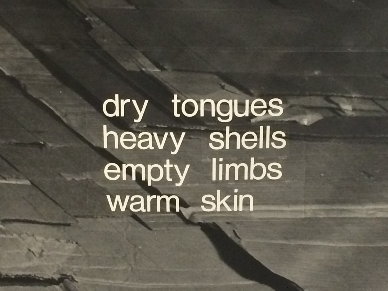
The text was used in this piece to give the viewer a description of what you could feel and see in the location in which the 
photograph was taken.


Thumbnail Sheet

This the thumbnail sheet provided during one of the workshops. What I enjoyed about this task was that it made you think. Only being allowed to use three shapes made to think about what you could make, it was a good exercise to get everyones brain thinking before starting other tasks.

mind mapping

This is the mindmap that my group made on the first week of the course. It contains all different ideas and usages we had for paper,, when we first got the assignment of paper we were all a bit baffled as we only saw paper for printing and drawing on. 


This mindmap was great way for the group and myself to get a different perspective of what you could do with paper, the different types, thickness, uses and limitations.

Sunday 3 January 2016

Physical Collage (Design Centre)

This is my physical collage of the images that I gathered of the design Centre. The collage was done on paper then I scanned it into the computer and then I added the threshold effect to it.


I had made multiple version of this collage but this ended up being my favourite out of the lot I had made. The threshold was put onto the image to make the image bolder as the colour seemed to fade on some of the images.

Physical layout

This image was made within the Physical and Digital Layout session. The image contains some of the copyright free material that was provided to us within the session. This was another session that I found useful as I don’t do a lot of work that involves manipulation of images on paper, it is mainly done on the computer, so this was a welcome change.

Digital Layout

This image was made in InDesign, within the Physical and Digital Layout session. The image consists of one image, repeated within a cycle pattern. The image was taken from on of the copyright free images that were provided to us for this session. 


This session was very useful for me as it showed me different techniques and        features that I didn’t know were available within InDesign. The different images we were given we all useful to test out different techniques within InDesign. 

Digital Collage

This is my digital collage that I made during the computerized part of the session. This collage was made from photographs I had gathered from inside and around the Design Centre. 


This was a good exercise for me to play around with Photoshop and re-familiarize myself with different effects and tools within the program.

Physical Collage

This piece of work was created during the collage session, this was one of the outcomes from the spontaneous layout section of the workshop. I photographed all of the different layouts that were created from this and then decided to stick down and commit to this layout. 

I am use to designing something and knowing what the final product will somewhat look like so that session was different for me as I didn’t really have any control over what the outcome would be.

Life Drawing

This is my best piece from the life drawing sessions from week 5 I found this session useful as it allowed me to brush up on my life drawing skills. I found this session very enjoyable it was a nice change of pace to sit in the studios and draw what was in front of me. 


I found the drawing of other students within the class a good experience as it allowed me to draw different figures and gestures.

Wallpaper Paste Papers

This piece was made during the mark making session, this is another material making technique that I have not done before. I was unsure about how my work would turn out whilst using this technique, the overall design looks very nice once it has dried on the page. I have used one of these pieces as a en-paper within my sketchbook, I think that it is a nice edition to my work as it is something I have not tried before.

Mono Print

This is my mono print, I found this piece of the workshop interesting as I do not have much experience with mono print; however, I found the outcome very nice. The drawing on the mono print is the mascot from my    word-press page, i chose to use this drawing to do on the mono print as I knew the drawing had to be done in a certain amount of time before the ink dried.

Crushed Packaging

This is a scan of two of my drawings from the crushed packaging exercise. This task was very useful as it helped me develop my drawing skills, by looking at text in a different way that I am use to.


 It was difficult to make sure I was drawing the font as I could see it and not how I know it to look. Both of these images were drawn using a pencil then re-drawn using a fineliner to make the lines bolder and darker.

Vinyl Lettering & Book Binding

These are the images I gathered from my vinyl lettering session using the made calligraphy on Illustrator.  Once the image was scanned into the computer I then vectorized it in Illustrator. 
After vectorizing the image it was cut out on the laser cutter and then placed onto my sketchbook. 


These images show the inside and outside of my sketchbook. The top image shows my completed sketchbook with my vinyl lettering on the front. The bottom image shows the binding method used to make my sketchbook, this method only uses paper not glue or staples.

This sketchbook has been very useful to document ideas and do sketches before committing to an idea, the black slider makes it easier to refile the sketchbook and the flap is perfect for storing extra content such as leaflets or sheets handed out during the workshops.